Data Analysis
Primary Dataset Visualizations: Confidence Level of Each Wildfire Count


These visualizations complement our interactive map that spatially represents the location of wildfires based on precise longitude and latitude values. This allows the respective government and related fire management services to assess potential environmental and health impacts on neighboring communities, especially in Aboriginal and Torres Strait Islander populations living closer to wildfire-prone forests and grasslands. Line graphs to display the confidence levels for both regions are highly effective because the reader can visualize the trends over time, especially during a side-by-side comparison. Fluctuations in confidence levels enable one to identify patterns in both regions, aiding fire management and monitoring. The line graph helps with the visual clarity of which fire to prioritize — crucial for the government and first responders to formulate solutions.
Both line graphs display the confidence level of each fire occurrence in both regions, measuring whether or not the fire actually happened. As the chart captions explain, a confidence level of a fire near 100 signifies the greater certainty that a fire occurred. For Indigenous communities, this is crucial when allocating resources and protecting cultural sites in a timely manner; Indigenous communities in the NT already do not have equal accessibility to the services that those living in Sydney have, and accurate data must be heavily relied on. For non-Indigenous communities, accurate data on fire occurrences can quickly safeguard infrastructure and protect people, as services can prioritize which site to serve first.
Primary Dataset Visualizations: Brightness Level of Fire Pixels


The bar chart displays the fire pixel with the highest brightness temperature captured that day by the MODIS satellite. Utilizing a bar chart to visualize the data can assist fire services when comparing which site they should prioritize. The height of the different bars leads to quicker solutions.
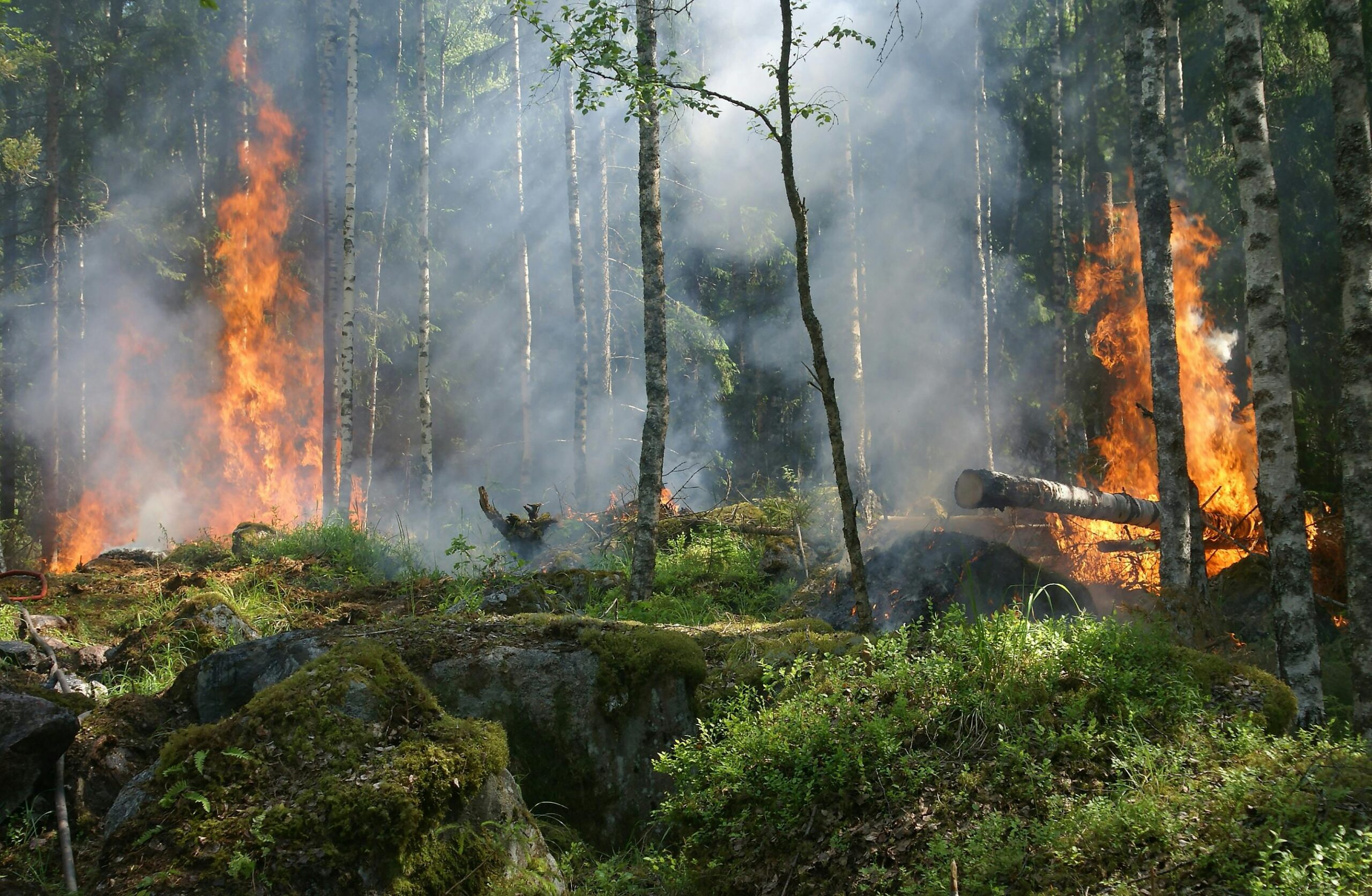
And because not many services are available and needed to sustain the small population in the NT, Indigenous communities are severely affected. Reactions to wildfire vastly differ in the NT compared to Sydney because of resources, like fire-protection services, available. However, that does not dismiss how the highest temperature of fire for a given day impacts Indigenous communities. This data captured by MODIS reveals the potential destruction of sacred sites and infrastructure in the Northern Territory. Indigenous people in the NT are often displaced; fires can alter their way of living because of depleting and scarce natural resources, along with losing their centuries-long cultural heritage and relationships with the land.
Supporting Dataset Visualization: Concentration of Fire Recordings Between March 2019 – August 2019

For examining trends and variations over time in the concentration of fire recordings, a line chart is highly effective. This chart type displays continuous data, allowing us to observe fluctuations and trends across a specific period. In this case, using a line chart enables us to track the rise and fall in the number of fire recordings from March 2019 to August 2019. The x-axis represents the month number in 2019 and the y-axis shows the number of MODIS (Moderate Resolution Imaging Spectroradiometer) fire recordings per month, providing a clear visual of how fire activity varies monthly. This is especially useful to our project because it allows us to compare these fluctuations with health data such as emergency room visits during the same time period.
The fire recordings chart shows an increasing trend in the number of fire recordings from March to July 2019, with a peak in July. The number of recordings then declines in August. The supporting chart displays the average daily presentations in emergency departments for respiratory diagnoses. It shows a similar trend to the fire recordings during the same time period. There is an increase in visits from March to a peak in July 2019, followed by a decline in August. The similar trends observed in both charts suggest a possible correlation between the increased fire activity and the rise in respiratory-related emergency room visits. As fires produce smoke and other pollutants, they can aggravate respiratory conditions. This leads to higher rates of emergency room visits for respiratory issues. The concurrent peaks in both charts shine light on the potential health impacts of fire seasons and the need for public health interventions. Further analysis could include data on air quality and other environmental factors. This would strengthen the understanding of this relationship.
Supporting Dataset Visualization: Quality of Health (Respiratory Diseases) for Aboriginal and Torres Strait Islander Communities in Northern Australia vs. the Non-Indigenous Urban Population of New South Wales

For providing a visual representation of a comparison between numeric values of categorical variables. This chart allows us to see which groups have the highest or lowest values, and how the other groups compare to each other. In our case, the bar chart allows us to see the differences in % share of total deaths due to chronic lower respiratory diseases in 2017, 2019 (the target year for Australian Wildfires), and 2021. Additionally, the bar chart’s implementation allows us to truly compare the dataset of these years. It provides an option to compare the death, provided as numerical values. The lengths of the bars provide an ideal representation of the values of the variables in a manner that produces meaningful comparisons. Although a line chart could potentially have been used to examine the trend reported by our chart, the bar chart proves more successful in our case because it provides a straightforward view of differences between variables rather than having to follow along a trend line to examine the extent of change. Furthermore, a line chart would have been appropriate if the data was separated by shorter variables broken into months rather than a gap of two years.
The purpose of this bar chart is to provide a representation of the % share of total deaths that chronic lower respiratory diseases had in 2017, 2019, and 2021. Given that the Australian Wildfires occurred in 2019, we chose to utilize data from years that were separated by a span of 2 to ensure that the chronic disease, which is more long term based, could have been developed as a result of the wildfires. Research has indicated that high levels of pollutants due to intense burns such as those in 2019 could have led to rapid development of the respiratory diseases revealing why 2019 has the highest percent share of total deaths. Furthermore, by using data for Aboriginal/Torres Strait Islanders and the urban population of New South Wales we are able to answer our research question’s aspect of the different impacts the wildfires had upon our two groups of study. The reasoning behind examining two different populations is to understand the difference in impacts of resource availability and responses to wildfire of rural indigenous regions and densely populated urban regions. As we can see from the developed bar chart, there is a significant difference between the two groups in 2019 (the year of the Australian Wildfire) and 2021 following the damage from the wildfires. The bar chart reveals that the Aboriginals and Torres Strait Islanders had a higher % share of deaths attributed to chronic lower respiratory diseases in 2019 and 2021. This difference likely exists because of the difference in socioeconomic status of our two comparison groups. The Aboriginal and Torres Strait Islanders are limited in resources, services, and infrastructure necessary for disaster preparedness and recovery, revealing why this distinction in % death share exists. The purpose of revealing this information in our study is that this could potentially lead to more advanced techniques in providing protection against wildfires.